Check out the Canola Performance Trial (CPT) website at canolaperformancetrials.ca and view the data in many different ways! To give you an idea of the options you have with the website, here are a few examples:
The 2016 CPT booklet in PDF form includes both small plot and field scale data. Read it.
Want to learn about how the trials are conducted? Click here to look at the protocol for small plot and field scale sites.
Search performance trial results. Play around with the CPT searchable database at the bottom of the homepage to see all the different angles you can look at the data from, including:
–Search through all varieties, a specific herbicide system or comparing 2 or 3 specific varieties at a time.
–Look at small plot or field scale data from Manitoba, Saskatchewan or Alberta, or from the short, mid or long season zone.
–Check out 3-year averages and 5-year averages in addition to the 2016 data (by selecting/deselecting the years to include).
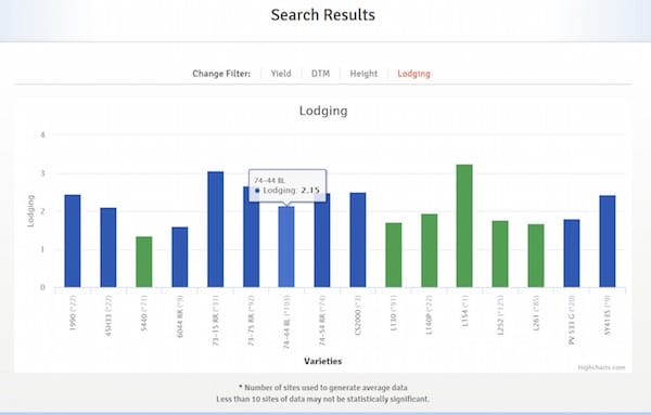
–View the data on lodging, days to maturity and height in addition to yield by selecting your preferred filter option above the graph title. (See Figure 1 below.)
Select/hover your cursor over a graph bar to see its specific value. (See Figure 2 below.)
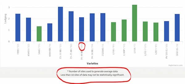
–Check the number of sites used to generate any specific bar (in a graph) by looking in the parentheses after the variety name (labeled along the x-axis). (See Figure 3 below.)
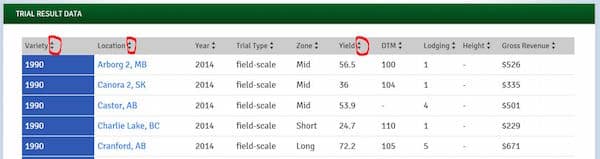
–Scroll past the bar graph on the page to see the data table used to generate those graphs and select/click on the arrows by each column title to sort the table by this topic (ex. sort the data table by variety name or by location or by yield values) (See Figure 4 below.)
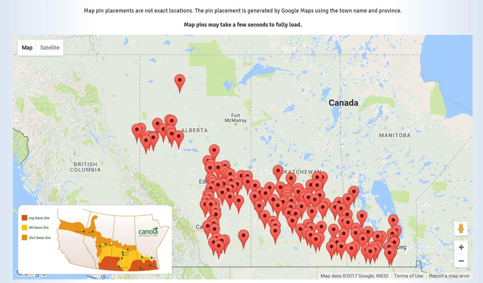
–Scroll past the data table to view all the site locations on a responsive map. Clicking on any of the map pointers will display the site location. (See Figure 5 below.)
If you have any issues doing any of these searches, feel free to email Taryn at dicksont@canolacouncil.org.